
The first thing I did was to borrow my son's light tent. It really is great, I don't know why I don't always borrow it... except that maybe I am too impatient to set up a good shot, or it could be that I feel bad borrowing the stuff that he paid for instead of getting my own... Either way somethings gotta change! I did decide that if I buy my own, I would like a smaller one than he has. His is about 2' across by 2 1/2' tall, which worked well, but the jewelry seemed so small inside that I felt like some of the light kind of got "lost" in that big area. I wanted it to be more condensed. Smaller would be a little less awkward to work with too. But, all in all, the tent made a great improvement.
I also played around with backgrounds. You may remember that in the DIY light box tutorial it suggested getting two pieces of poster board; one white and one black. I tried that, and I, personally, don't care for the black. There is probably a method for using it that I'm not aware of. If someone knows it, I would love to hear about it, because it came in a package of 5 sheets. :)
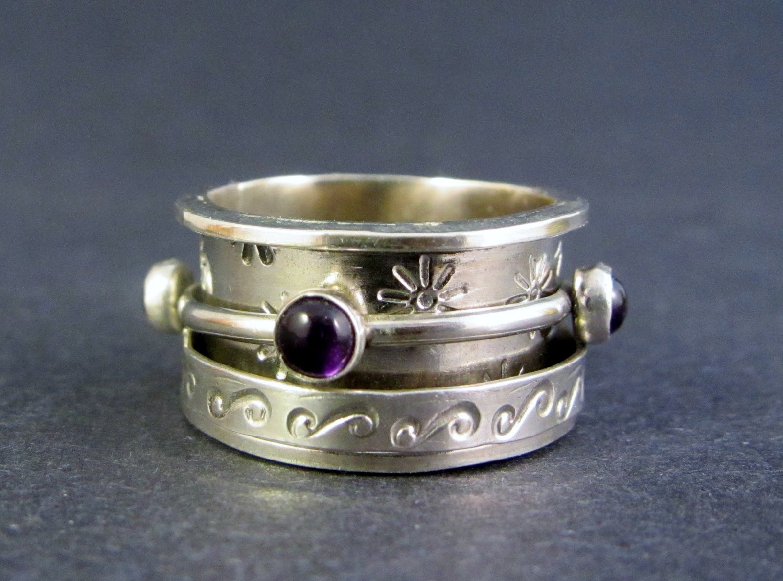 |
| Amethyst Spinner Ring |
See? It just doesn't do anything for me. Again, The Tabletop Studio has a solution, this black acrylic sheet and accessories, which look pretty, but has a pretty price too. But look at this! Here's a 12" x 24" piece of black acrylic for under $8. Of course that's minus the lights and other accessories, and you'd want to read up on how to set up the shot, but it's definitely a more affordable route.
Back to poster board.... I did like the white.

The white background is nice and clean. I tried to adjust my lights to minimize the shadows, and while I wasn't able to completely eliminate them, I still think they turned out quite well. You'll notice the bottom left picture has a different hue. That piece is made of bronze, and I tweeked it a little in Windows Live Photo Gallery to make the bronze color a little more accurate. I don't do much tweeking, frankly because I don't know how. But I also wonder why you would want to make the picture you're posting look any different from the piece you'll be mailing out? I almost always click on "auto adjust" though. It usually makes to colors look more accurate than the original picture does.
Although I like the white, I experimented some more by printing out some gradient backgrounds. I just googled "gradient backgrounds" and clicked on "images" and there were a ton of them. I found a few I liked and printed them out on photo paper (be sure to find non-copywrited backgrounds). I tend to like the more subtle backgrounds, but that's just me. Find what works best for you.

This blue was a bit bright for me. I chose it because I thought it might help bring out the purple color in the amethysts on the top ring. It didn't. I had trouble with those amethysts! I do kind of like the reflection in the picture of the ring on the bottom.

The above pictures were taken with a background that was very light blue (almost white) in the center and became more of a sky blue as it radiated out. Because the jewelry is so small it was hard to position it in a place where the camera would catch the gradient color. In other words, in the background immediately surrounding a small piece of jewelry there was not a lot of graduation of color - it almost looked all the same color. The necklace shot was easy because it covered more of the background. I took several that way, and they all turned out nice. You might notice I have the amethyst ring propped up, hoping to catch the color. It's a bit better, but I don't like that particular prop.


Two more things that I definitely think are worth mentioning are to always use a tripod (and maybe your camera's timer or remote if you have one) so there's no wiggle, and to have your camera set on the highest quality pictures. Especially if you aren't using a camera with a macro setting, because you're probably going to have to crop them. That can accentuate any blurriness, and make them a little pixely if they are on a lower quality setting. If you have trouble uploading them onto a site because the file is too big, you can always resize them. But I like to keep the original in case I ever want to print them for a catalog or something.
Ok, I think I've told you everything I know! Hopefully I have not confused you or led you astray. Remember, I am on a journey of learning. Any tips, comments, or corrections are welcome, and in fact, hoped for!
After last weeks post, Cheryl @ Sew Can Do made a comment about a light scoop. I didn't know what that was, but she loves hers! I found it here. It looks like a great invention to me, and I'd love to give it a try, but I don't have the right kind of camera. I've been trying to think up a way to rig something up for me to use.... haven't finalized that thought yet.
I also want to thank UKZoe for mentioning looking on ebay for less expensive light tents. As I mentioned last week, less expensive makes me happy! :)
Alisa
I am lucky if my photos aren't fuzzy. Following you back!
ReplyDeleteHey, looks great! Do you use Photobucket.com? May help too. Thanks for the follow Following you back. :)
ReplyDeletehi Alisa thank you so much for liking my blog for the sweet comment and for following ,i have gone through a few posts of yours, your jewelry is breath taking you are very Talented :) i wish i could make jewelry like that
ReplyDeleteoh and i am following you back :) we will become very good friends hopefully:)
ReplyDeletegreat job, I like the white and the gray backgrounds to feature your beautiful pieces. Hugs
ReplyDeleteThank you for sharing and for visiting Katherines Corner. Hugs!
ReplyDeleteThanks for stopping in at Cranberry Morning today. I'm following you back! I visited your Etsy store also...what beautiful jewelry!!!
ReplyDeleteI love your jewelry! You have a lot of talent, and I will be checking out your blog from time to time to see what's new. Keep it good and be proud.
ReplyDeleteCecelia
411onthefreebies.com
i do agree that they gray is a lot better. have you ever thought of using a plain colored fabric (a plain velvet or satin)? this would eliminate the reflections and if you crumpled it slightly it would lessen the shadows that are seen from your flash.
ReplyDeleteas far as editing goes, i use picnik.com. the editing tools that they have are mostly free. there is a premium service for $25/yr. but the free features are great for just about anything. you can adjust the saturation, exposure, contrast, simple things. as well as add features like cross-processing, selective coloring, different camera styles, etc and watermarks. i love it and use it for almost every photo i do.
thanks for stopping by today and for the follow. your follow button and followers aren't visible no matter how many times i refresh. just had this problem with another page. am going to put you in my taskbar and try again later :) blessings, andiejaye @ crayonfreckles
these look great! I had fun checking out your blog! I am your newest follower and would love it if you would check out my blog and follow me too! Thanks!
ReplyDelete-Nikki
http://chef-n-training.blogspot.com/